8/3/13

Update at Long Last - House Now 75% complete

I've had a few comments on the blog asking for updates so here goes a summary of this interesting and tedious process. 

Where to begin?  Looking back at the pictures of my last post (which was in April, it's now August...) a lot has happened.  So much!  Between shopping for a zillion lights (and still not done), figuring out dimensions, assigning electrical plans, determining the right type of stone, the width of countertops, etc etc etc it's never ending and I lost time for the blog.  Re: the ICF portion, once the "stick build" interior walls went in, it wasn't nearly as complicated and also it was much easier to edit mistakes and make changes, etc. 

Things That Went Awry: 

1.  My architect and I agreed that a 2 x 6 interior wall would give the house that "classic solid" feel and would complement the thickness of the ICF walls/windows.   I am SO glad we did this regardless of the extra cost - the interior looks great and it just has such a more authentic feel that matches the thickness of the windows, etc.    That being said, my architect also specified 10x12's for my ceilings which was completely unnecessary and ultimately was waaaaaaaaaay over my lumber budget.   My builder apologized for not catching it, what can you do but at least he's honest about it.   So, I have huge ceiling joists that are pointless and hidden behind drywall ceilings, but on the positive side it also makes the house that much more secure in a tornado incident so there's the silver lining of this extremely costly error.

2.   No one explained to me the guidelines for the electrical plan budget, and I innocently went forward to create a page per room that outlined every detail of the plan:  where the outlets should go, how many outlet openings in each receptacle, which switch goes to what,  adding sconces, etc. etc.   Then I was sacked with a $10K electrical overage and about had a heart attack.  In the end we negotiated the cost down but I had no idea this wasn't the norm and everyone agreed it was a severe communication gap all the way around.  That being said, my house will be beautifully lit with a ton of sconces, etc!

3.  Stain-grade materials.  Because we are building the interior in a more "spanish colonial" fashion (i.e. neutral walls, not much molding or trim, and dark windows, baseboard and doors) we looked forward to saving the cost of those materials.  After all, we have NO casing around our doors, NO crown molding or extra trimmings, etc.  Just a very stark look.  But as it turns out, when you are doing stain-grade materials instead of paint-grade materials (which is usually MDF), that will actually double your budget!  So that was a huge surprise to everyone involved.  Not many homes in this area are done in this way, so it wasn't anticipated and came as a big blow but what can you do.  I had to compromise on pine (not poplar) doors to stain (but they turned out nicely dark so that's good at least) and our baseboard is costing a small fortune.  Lesson to be learned?  Stain-grade materials will cost you more than paint-grade, even if it's not a lot of it.

I'm sure there is more, but these were just the major issues that stick out in my memory during this process.


Things That Are Good:

1.  I'm a natural light fanatic and we added interior transoms for any rooms or passages that did not have a window or natural light feeding into it.  I also added transoms above the doors in the main hallway that does not end in a window (I'm a huge fan of Susanka's concept of "light to walk toward", which I did not have in this space) and it made a big difference.   I will post pictures after the finished product but what a difference a piece of glass makes on the interior walls when natural light is at a minimum.

2.  I added a tiny "mail drop" desk for charging phones, keeping my purse, mail, etc INSIDE my pantry corner.  That way all the junky stuff can still be dumped in the kitchen but is hidden behind a door so that there's no clutter.  Very happy about this!

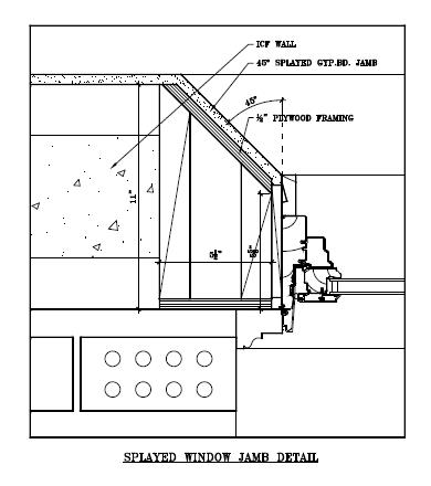
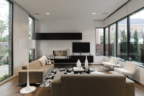
3.  The splayed windows in my home are beautiful.  Beautiful.  So many people comment on them, including the ICF subcontractor who had never seen it before (!).   Highly recommend this for ICF walls.  In hindsight, there is a tiny place on the top right exterior of my home where I wish I had done the OPPOSITE of this, and splayed the EXTERIOR to sneak in a tiny recessed window in that spot.  You can see what I mean in this example here (second picture down, window at top left):   http://www.thingsthatinspire.net/2009/12/on-market-in-atlanta-beautiful-french.html .  Sigh!

4.  Natural light and views.  The way each window was planned out according to the views and how the light played into the room makes the interior so nice.  It's the first thing people comment on.  Placing the windows so that it creates a vignettes of a view to exclude anything unsightly gives the house such a great feel, and even on a cloudy day the light streams in.  It's very welcoming.

5.  Kerf.  I had no idea what a kerf drywall return was, but after much research looking at rounded-drywall techniques, my builder convinced me that this was the best way to go for the sleek rounded corners and minimalistic look I so love. I felt apathetic as to how it would be done, but I'm so glad he was insistent that kerf was the way to go.   He was spot-on, and the kerf returns around my casing-less doors look fantastic.  Worth the extra $$ and time (though my drywallers might disagree!) :-) 

6.  We added a few true-radius arches in the main hallway passage.  With the 2x6 walls and rounded drywall, it really adds charm. 

7.  If you have kids:   originally I had a tub/shower combo in my 6-year old son's bathroom.  While at a friend's, she told me that her son's bathroom (same age) is a shower/tub combo and now her son always goes downstairs to shower in their nice master shower instead.  I thought long and hard about this but it makes perfect sense.  We edited the already-installed plumbing for the tub, and now my son's bathroom will have a very very nice shower instead, that I'm sure will get much more use to come.  We only have one tub (a freestanding, "claw foot" type downstairs in the 2nd master) in the whole house and I'm fine with that.  We kept records of the original tub plumbing installation in case this is ever an issue on resale (say, someone with very young children), so that the area could easily be converted back to a shower/tub combo without much effort.  I'm so glad I didn't put a normal shower/tub combo in there, after all.

That's about all I can come up with via memory right now. 
The rest of the progress can be told in pictures...
----

OLDER PICTURES

Roof is on: 


Here is how an arched window is fitted into an ICF wall - the most economical way to go is to have the arch done in wood and then spray foamed after the fact:


My completely over-the-top huge ceiling joists.  A good view of the splayed windows in the upper portion of the great room. Notice how the top splay is flat, directing the light downwards.  It casts great shadow effects on the wall during sunset time, too:


The arches inside:


The foyer where the steps go above the front door.  This was SO complicated especially with Codes.  So much so that we are in a dilemma with the front door exterior now since everything had to be edited on-the-fly as they went along.  Still, it will be charming in the end, at least on the inside!  Also another huge splayed window - they drill holes in the wood splay surround and spray foam inside of it:


The great room window.  This was the old staircase and we had edited the window placement on the fly once the house was up, and made it lower than on the original plan.  Consequently, I decided the banister blocked the window too much, so the framers ripped the whole railing wall down, I gained the under-the-stairs space as part of the great room, and this will now be a glass railing to enable the view of the blue skies that the window gives.  A huge splurge but the effect should be great! 


Check out the sloppy window surround.  This is what happens with the ICF company edits the matching window above it, but doesn't match the window below it and it ends up looking "off" outside.  Concrete was therefore chopped away, a wood frame was built, etc.  You'd never know it now that the drywall is done.  Not fun.  Side note: someone had asked me about the corner window dilemma - this is how it turns out, with the space between the windows having almost a "double" line, and the top and bottom portion having one clean line.  We couldn't go to the expense of having steel made to do a completely clean corner, so went with the ICF pieces butting up against each other at the very minimum allowed for support.  It's a little quirky but it's something myself and my builder only noticed and nothing too dramatic.


The great room two-way fireplace is up: 


RECENT PICTURES:

To the left is the kitchen sink window.  To the right is the great room.  Beam is added simply for interest, serves no purpose otherwise. 


Back of house with the brick & Recote color on.  I love the back of the house - wish HOA would let me do something more this modern "California" style but oh well.   Screened porch not on yet:


Street view of house.  It's embarrassing that the house looks so huge from the front...  it's a very looong house designed for the lot views, in that it is only 1-room deep in more than half of it, but from the front it looks bigger than I would prefer.  I was also displeased with the left "wing"  looking so vast and plain due to the fact that we had to edit the original slab to a crawl that increased the height by 6-12 feet in some places.  I'm compensating for this by adding a huge windowbox on that lone big window and then we'll add a higher berm of landscaping on the left "wing" to even out all that excess brick space.  I'm thinking when it's all said and done it should look pretty good but we'll see...


Stone going on the window arches.  I'm not happy with the weird arch over the front door but have agreed to wait until the entire front patio is stoned before we address that quirky area again.  It's been redone 3 times now: 


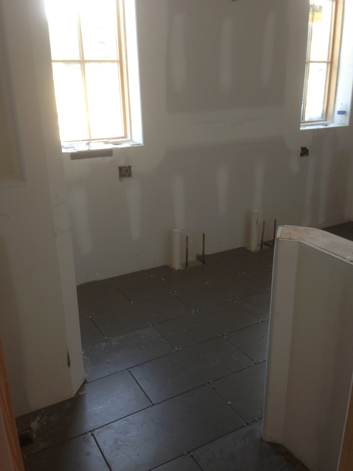
Guest bathroom tile is in:


Foyer travertine tile is in: 

Kitchen cabinets arrived.  It's going to be a very tricky job since they have to hang the cabinets first, and THEN do the 2 stone walls in the kitchen, not to mention I have an infinity windowsill that will be my countertop.  Lots of meticulous details.  Below is floor sample, cabinet, white quartz and wood shelf: 


Laundry tile is in.  This is the most colorful thing in the house: 


Once the lot was officially cleared with all the brush removed, I was in awe of how truly large (and flat - yay!) our backyard is, especially for a subdivision:


 There's a brief update of the last few months!


4/2/13

Update: house chugs along

It's been a while since I posted...    the concrete was poured in the 2nd story without issue, thankfully.  There were a few windows that were off and needed to be edited with the concrete saw (the ICF guys' fault, not mine - they forgot to match up corner windows when they edited one for support purposes downstairs.  I can see how they would make the mistake and forget by the time they did the upstairs). 

Everything went smoothly, and basically the house sat for a while letting the concrete cure.  There is one very large expanse of upper wall in the great room that STILL has braces on

it, 3 weeks later.  They are keeping the braces up for a while to ensure that the concrete is completely cured and a solid support system.  Fine with me!  It's amazing how many braces you end up in the house right before a pour, and the great room still has a ton of them supporting this wall shown:


Up next is picking out the brick and stone, and trying to finalize framing changes/tweaks on the interior.  Lots to do! 

Progress: Roof and an oversight

The roof is coming along and the house is taking shape. We live in one of those areas where a ton of the houses tend to be "McMansion-y" and as my architect and I like to joke, are "all roof".  Why is that?   Yes, my house is larger that I would personally prefer, but the roof was one of those places where I could hopefully make it seem less imposing somehow.   Our house is at the minimum HOA roof slope requirement intentionally, with the roof pitch being consistent with this type of home style.  My husband was a little dismayed with the lack of pitch compared to the surrounding homes, and I got a little laugh at that.   It's funny how something like a roof pitch makes a difference between oozing charm or looking overbearing.   Here it is, below.  Can you imagine if the roof were much higher?   It would have looked even more large and daunting. 


Frustration - mistake on the overhang

Originally my architect had drawn this house to have beautiful exposed rafters under the eaves.  I nixed this idea, however, since our old home had tons and tons of wasps making nests in the eaves all the time, and all I could think of was how many extra opportunities every bracket would offer to an insect to make a nest.    Now that construction is coming along, I was kind of regretting that, and had asked my builder if there were a way to preserve the exposed brackets now that the roof was coming along.  In that process, I sent my architect a photo via my cell phone and asked her opinion if doing it the "cheap way" (i.e. since the construction is already there, and not the more elaborate way she had documented to do it "right") was even worth it.  Much to my surprise, she replied that it looked like my eaves were not large enough as per the plan, even though she was just basing this assumption off a mere cell phone pic.   Sure enough, my builder took a look and confirmed that all my overhangs had been constructed at 16" and not 22"!   I was feeling a little frustrated that both my GC and my framer missed this, even with the plans clearly marking the layout of everything.  What if I had never sent that picture to my architect? I would have ended up with hardly any overhang.  Now, they are having to extend the rafters another 6" and I'm guessing that somehow I will end up paying for it, even though supposedly I will not see an increased cost.  We shall see.

A blip in the scheme of things, but frustrating nonetheless.

3/7/13

Progress: Second Floor and (Apparently Uncommon) Splayed Windows

The 2nd story ICFs are almost complete:


The great room stair window dilemma has been decided upon - I'm interested to see how it turns out because it is a very large, very splayed window where the "splay" portion at the lowest left corner of the stairs will be very close to the baseboard of the step, but everyone agrees it will look really cool and that it's not a concern.   I'm not sure I'm convinced, but I'm going with the majority on this.

Speaking of splayed windows, apparently this is a new endeavor for both my builder and the ICF guys.   With having such an immensely-high ceiling in the great room, I was worried that the square windows at the top would be "lost" tucked back into the thick ICF wall.   I had asked my architect to splay the window, and she has done so in a fashion that will expose the windows more, and more importantly play on the light coming in with the angles.  Our great room upper ceiling is like this:


and the windows should be splayed in a similar fashion as these upper ones depicted here:


Traditional Living Room design by San Francisco Photographer Bernardo Grijalva Photography

As to doing a splayed window in an ICF wall - apparently that gets to be tricky.  They are going to widen the rough openings to allow for the splayed angle portion, then the angles will be created with wood and then spray-foamed.  My architect's instructions are below, but we'll see how it plays out in the field...   


3/5/13

Progress: Upstairs, and Window Drama Yet Again

Ironically, after looking at the great room stairs picture I uploaded in the previous post, it just seemed like the window (or lack thereof) was wrong.  If I compare this mock-up that our architect did for us long ago:

to the picture of the great room stairs now:


...  it's way off.  I'm all for privacy from the street in the great room, but this is a little much!  Thankfully, yesterday my builder had noticed that the ICF guys had not filled this area all the way to the top with concrete during the first pour, in anticipation of placing a window.  Sigh of relief!  We are now working on getting that edited, needless to say.

In other more progressive news, the upstairs has begun.   Once again, I feel the house is too big which would not have been my preference: 


That's the hole to the foyer below, which has a double ceiling.  Another area of contention was that the contractors were freaking out that some of the windows in the back are not the same head height.  My architect and I realized this wasn't the norm, but I've always said "business in the front, party in the back".  It was funny - as much trouble we were having with the language barrier, as soon as I said that, the contractors understood and started laughing.  Carry on!

3/4/13

Fireplace Wall Design - The Big Looming Decision


This decision needs to be made this week due to the 2nd story ICFs going up.  To be sure, the Main Living Area is absolutely the most important decision to make in a house.  This is no exception for mine.  Below is the main living area recap on the house, with the red box indicating the "most important wall decision in the house".  The house is going for a very open floorplan in the main living area, starting with the library (see minor library edits previous post), breakfast, living and study all centering around the openness of the kitchen: 


and how the furniture layout is anticipated to be:

Now here's a look from the breakfast vicinity looking out into the great room, with the newly-built stairs:

and the view standing from the study (which is really a den) into the great room and kitchen beyond: 


those red lines are up for debate and the only thing that is certain so far:  1) it will have a 2-way fireplace and 2) the TV goes here.  A local design instructor friend may come over at some point to help me map out exactly what to do with this priority wall, because I'm just uncertain (a rarity).  Up for debate:

1.  should the wall be closed on one side of fireplace?
2.  or left open on both sides of the fireplace for a total open feel?
3.  or do a "partial" as it is now, with a sliding wood panel "interior window" of sorts and maybe a drop-down from the ceiling line since the room is 20' tall? ...  ...  

Somehow, Someway:  A Cohesive Clash of Styles...

Then there is the issue of schematics and material of the actual fireplace wall.  Material choices aside, the below pictures are all appealing for different reasons:


Contemporary Living Room design by San Francisco Media And Blogs California Home + Design

...  I want to meld the above more "urban" style with the soft and clean palette of the style of my house. It needs to be unexpected but still conform to the aesthetics of the house So, I found a picture of a room similar to the great room in look/scale:

Mediterranean Family Room design by Phoenix Architect Carson Poetzl, Inc.

Then, I copied & pasted various features until I could get a more realistic look of what my room might look like.  These ended up being my two favorites (forgive the "stairs" - this is a very rudimentary attempt on the old school Paint program): 


I've sent it to the architect to see what she comes up with.  We shall see. 
 

3/3/13

Progress: Garage and It's Fantastic Dual Purpose

The garage is up.  I must say it seems rather "wimpy" because unlike the rest of the house, it is made of traditional wood construction. We did this per our ICF contractor's recommendation, but if the big bad wolf comes that thing would be toast ;-)    Just looking at it compared to the ICF shell makes you really appreciate the true efficiency of an ICF wall.  We do plan on doing spray-foam insulation in the garage.  So here's the garage, which completes the footprint of the house:


The house looks deceivingly large because it is a long, boomerang-shaped house, and the garage only amplifies that effect!  Half of it is only one-room deep, but from the front it seems massive. However, the shape really works now that it's totally complete.   As mentioned in my first posts regarding the lot, the beauty of the garage location is that it transforms what would have been a "subdivision-like" yard into a very private oasis, like so:


in looking above, you can see that no matter where you are in the house, the ENTIRE back yard is private (there is only a treeline on the other side).  Perfectly private.  One would never know there was another house beyond the garage, and incorporating a more "courtyard" patio system in the back, now that the walls are up, seems like a natural progression in the future. 

What Would You Do?  That Looming, Big Garage Wall 

That being said,  it's important to be thoughtful as to how that brick wall appears once the bricks are applied.  Since that wall almost functions as a "feature" wall when anyone is out back, it might be good to add some design elements to "warm" that space up.  For instance, here's a picture of a newer home that did a similar thing on their back wall.  Personally, I'm under the impression that they wanted it to look "old" by making it look like these were old door openings that were bricked in:


...  now, I'm not sure that particular look is for our home, but the concept is the same.  Perhaps some decorative brick detailing design to amplify that wall as more of a courtyard space when the possibility arises to add a patio over in that area would be nice.  Even if it's just a few simple rectangles of slightly raised brick with a herringbone pattern inside, to deviate from the large flat expanse of brick on that wall:


What do you think?