Showing posts with label Style and Design. Show all posts

3/4/13

Fireplace Wall Design - The Big Looming Decision


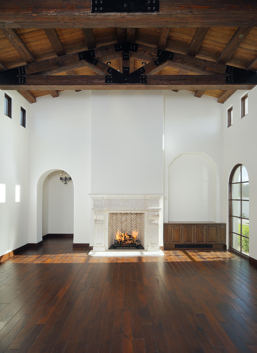
This decision needs to be made this week due to the 2nd story ICFs going up.  To be sure, the Main Living Area is absolutely the most important decision to make in a house.  This is no exception for mine.  Below is the main living area recap on the house, with the red box indicating the "most important wall decision in the house".  The house is going for a very open floorplan in the main living area, starting with the library (see minor library edits previous post), breakfast, living and study all centering around the openness of the kitchen: 


and how the furniture layout is anticipated to be:

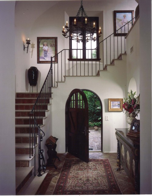
Now here's a look from the breakfast vicinity looking out into the great room, with the newly-built stairs:

and the view standing from the study (which is really a den) into the great room and kitchen beyond: 


those red lines are up for debate and the only thing that is certain so far:  1) it will have a 2-way fireplace and 2) the TV goes here.  A local design instructor friend may come over at some point to help me map out exactly what to do with this priority wall, because I'm just uncertain (a rarity).  Up for debate:

1.  should the wall be closed on one side of fireplace?
2.  or left open on both sides of the fireplace for a total open feel?
3.  or do a "partial" as it is now, with a sliding wood panel "interior window" of sorts and maybe a drop-down from the ceiling line since the room is 20' tall? ...  ...  

Somehow, Someway:  A Cohesive Clash of Styles...

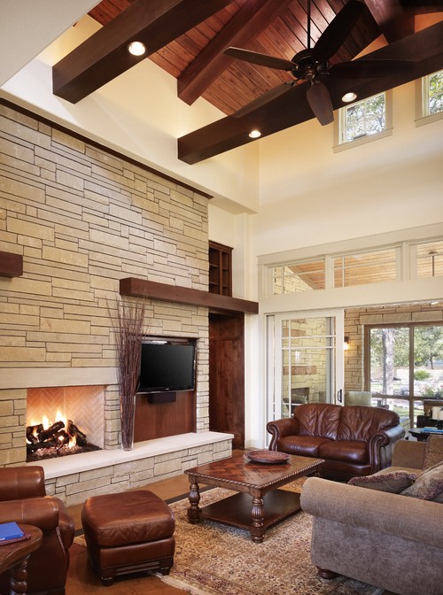
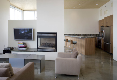
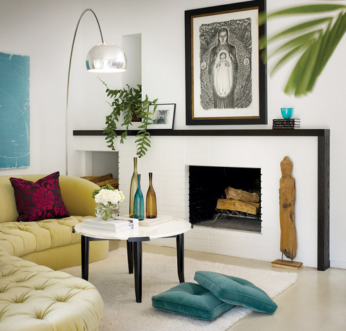
Then there is the issue of schematics and material of the actual fireplace wall.  Material choices aside, the below pictures are all appealing for different reasons:


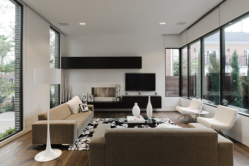
Contemporary Living Room design by San Francisco Media And Blogs California Home + Design

...  I want to meld the above more "urban" style with the soft and clean palette of the style of my house. It needs to be unexpected but still conform to the aesthetics of the house So, I found a picture of a room similar to the great room in look/scale:

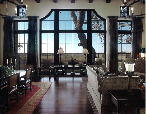
Mediterranean Family Room design by Phoenix Architect Carson Poetzl, Inc.

Then, I copied & pasted various features until I could get a more realistic look of what my room might look like.  These ended up being my two favorites (forgive the "stairs" - this is a very rudimentary attempt on the old school Paint program): 


I've sent it to the architect to see what she comes up with.  We shall see. 
 

3/3/13

Progress: Garage and It's Fantastic Dual Purpose

The garage is up.  I must say it seems rather "wimpy" because unlike the rest of the house, it is made of traditional wood construction. We did this per our ICF contractor's recommendation, but if the big bad wolf comes that thing would be toast ;-)    Just looking at it compared to the ICF shell makes you really appreciate the true efficiency of an ICF wall.  We do plan on doing spray-foam insulation in the garage.  So here's the garage, which completes the footprint of the house:


The house looks deceivingly large because it is a long, boomerang-shaped house, and the garage only amplifies that effect!  Half of it is only one-room deep, but from the front it seems massive. However, the shape really works now that it's totally complete.   As mentioned in my first posts regarding the lot, the beauty of the garage location is that it transforms what would have been a "subdivision-like" yard into a very private oasis, like so:


in looking above, you can see that no matter where you are in the house, the ENTIRE back yard is private (there is only a treeline on the other side).  Perfectly private.  One would never know there was another house beyond the garage, and incorporating a more "courtyard" patio system in the back, now that the walls are up, seems like a natural progression in the future. 

What Would You Do?  That Looming, Big Garage Wall 

That being said,  it's important to be thoughtful as to how that brick wall appears once the bricks are applied.  Since that wall almost functions as a "feature" wall when anyone is out back, it might be good to add some design elements to "warm" that space up.  For instance, here's a picture of a newer home that did a similar thing on their back wall.  Personally, I'm under the impression that they wanted it to look "old" by making it look like these were old door openings that were bricked in:


...  now, I'm not sure that particular look is for our home, but the concept is the same.  Perhaps some decorative brick detailing design to amplify that wall as more of a courtyard space when the possibility arises to add a patio over in that area would be nice.  Even if it's just a few simple rectangles of slightly raised brick with a herringbone pattern inside, to deviate from the large flat expanse of brick on that wall:


What do you think?


2/26/13

Progress: Framing and Some Design Edits

The front door saga from the previous post continues, but after much thought we are just telling them to fix it.  Just one of those mistakes that unfortunately needs to be fixed on our dime.  So, waiting to hear how they expect to do that and get rid of a 6ft chunk of our concrete wall.  Good times!

The downstairs framing is now complete (2nd story ICFs to begin now) except for the fireplace wall in the great room.  This is the most important wall in the entire house from a design/impact perspective.   Normally I make decisions at lightning speed, but this particular wall has me being very thoughtful and I want to wait until everything is in (stairs, framing) before depicting its use.  I'm actually having a friend from a local design college consult on it for me when it's time, just so that all options can be explored.  I'm not sure if I want it as a "standard" built-in shelf/TV wall, or a more modern/edgy version, or just an open non-wall altogether.  Right now we have a cool "interior window with sliding wood panel" there but I want to explore other options too.


As the above picture indicates, I've also shrunk the stairs to as narrow as codes will allow, and to my delight the layout allowed for us to eliminate the bottom landing step as well as the support post in front of the cooktop in the kitchen, which will make it seem even more open and unobstructed. 

Here's a view from that non-existing fireplace wall into the kitchen.   The great room picture window is to the left and the kitchen sink window to the right:


Thank You, Author Sarah Susanka 

As noted below, I'm debating making that one big pantry, or at least moving the wall a little bit as seen below.  Another thing that surprised me was that I moved the wet bar.   On paper, even though I wasn't happy where the wet bar was, it seemed ridiculous to move it into the "hallway" opening.  See:


the red "X" indicates the old wet bar.  Originally the architect disliked the wet bar in the green area because of symmetry concerns, and I didn't disagree.  After walking in the actual space though, now it makes perfect sense:  it's across from the dining room so that makes sense, it opens up to the kitchen and that makes sense, and it's twice as big to allow for more amenities.  Since this "pocket" of hallway is a waste-of-space due to the angle of the house, I'm also adding some architectural interest to make all the rooms cohesive by adding a push-through niche of the wet bar countertop.  This idea comes courtesy of the zillion Sarah Susanka "The Not So Big House" books that I read before the construction process began...

the view from the kitchen side - note the counter top opening just barely peeking through the wall: 


and what it would look like from the hall entry side: 


The wet bar shift also now allows for those double french pocket doors in the library to be larger and moved over more, which I like because it opens it up to the kitchen even more, and also we are hoping to add upper cabinets at the wet bar, yet still allow for an interior transom in there for more natural lighting.


Minor changes, but overall a surprisingly nice flow. 

And one more - there was yet another pocket of wasted space that always bothered me in the downstairs guest bedroom, but the architect felt strongly about it for the same reason - symmetry.   I've made the edits after seeing it though.   Some symmetry will still remain, but now I'm doing a half-wall to the right of the tub, and then a decorative niche of some sort (for artwork/whatever) on the facing wall of the linen closet as you enter.  This greatly opens up the room and makes it feel bigger, and I'm fine with it: 


2/4/13

Kitchen - Materials

Our old home had off-white cabinets with glazing, and was pretty much the "french country" style that was very popular for oh, a decade or more.  While I still think that is lovely, I'm taking an edgier step with our kitchen.  At the same time, I want to maintain style longevity and a seamless relationship with the surrounding "california-ish" architecture style.

My husband still likes the glazed-french-country-ish cabinets.
I'm tired of them. 

The good news is that we have agreed on one cabinet that appeals to us both:  the Starmark cabinet in "Villa Mushroom" that will hopefully not cost us a limb since it's the ONLY one we agree on.  Our compromise is that the finish is sleek and urban, but we'll go with a more traditional cabinet style that is hopefully inset, depending on cost.  Thankfully Starmark cabinets seem to get great reviews so that was a relief when I did my homework.

CABINETRY
Here's a picture of the FINISH (Villa Mushroom), it's a cross between an off-white and a linen color depending on lighting:


and here's a picture of the cabinet STYLE (this is actually Starmark's "Villa Pearl" if you are curious.  It can come across as very light  silver-white or grey, depending on lighting):


If it were up to me, I would do this cabinet style in a heartbeat, but thankfully it truly is an Italian-based fortune so I won't even attempt to ask:


and this is what the "Villa Pearl" cabinet finish looks like with my chosen solid hickory floor:


COUNTER 
I'm undecided on the actual countertop yet, but i have a feeling it will be an off-white quartz for a very fresh look, not sure.  

BACKSPLASH
As mentioned in my first Kitchen post, one thing I love about "Uncle Tom's Kitchen" is the stone wall, which happened by accident when they tore the garage down.  I know my kitchen couch wall span will be this stone.  I'm undecided if this will be my backsplash wall too, depending on how it flows with the existing great room wall.  


It will be the above, but with a cream-colored over-grouting technique like this:


LIGHTING - WHAT TO DO? 
Speaking of the above pic,  I plan on a similar concept with no above cabinet to the right of my fridge in that little angled space.  Perhaps with a drop-down pendant like the above, or an architectural element to add interest.  I know pendant lights are popular, but I just can't see them dropping down above my barstool area, can you?  I think it would become dated very quickly.   I'm thinking a dropped soffit with recessed lighting.    Then a cool hanging light above the kitchen table instead, probably also with a soffit to define that space.  What do you think?


2/3/13

Foyer (and the front door dilemma)

This will pretty much be the foyer.  I love it for it's unusual shape and arched door. 

Mediterranean Entry design by Atlanta Architect Summerour Architects

ICF: SPLAYED WINDOW DETAIL
One detail I don't want to be overlooked is the splayed cut for the upper window.  I'll be interested to see how it goes on an ICF wall - I guess they just do accurate cuts?  We'll see.  There are a few other splayed windows in our great room, too, that will need to be done in the same way. 

A VINTAGE FRONT DOOR...
TO USE OR NOT TO USE?I fell in love with a vintage door available at a local architectural salvage company.   I would love to use it as our front door after it gets some TLC, but when I was about to purchase it last week, I noticed the grooves went all the way to the top.  This could potentially mean a less-than-great seal, not to mention I'm already risking that the door may be imperfect, though it looks like it's in great condition from all angles that we measured.  I do love it: 


What do you think?   At the very least, I've contemplated using it as our back garage door instead, since that's a stick-build and having an airtight shell is not so much of a concern.  Not to mention it would make a beautiful statement from the back, but I'm just not sure how that would integrate with some of the more "clean lines" feel in the backyard.  Then again, it may add interest in an unexpected way.

FLOORING
Everyone says to do hardwood, but the foyer is definitely a place where I'll do a tile floor since I like more detail in small spaces, period. 

THE LIGHTING DISAGREEMENT
I am flipping over this chandelier for the foyer if the size worked.  Alas, my husband emphatically says n.o. and that it "looks like a fish". 


This is our compromise, which I found at a local store.  I still haven't committed to purchasing it yet since the lines are a little curvy for my taste, but I do like it more than anything else I've seen.


BANISTER 
I'm undecided on a banister. I should probably go with something that is simple black iron like the top picture.  But I do wonder about a wooden one, as well...

2/2/13

Bathroom - The Main Powder Room

I like drama in small spaces and have always loved a nice powder room.   My powder room is on the more spacious side because a) in my dreamworld we will someday have a pool and b) there is an exterior door to the screened porch.   This is the layout:


With just a little effort, the powder room can be so much more than the standard pedestal sink and toilet that seems to be the norm. So, I'm converting a dresser into a sink.  I looked around at various antique stores and boutiques in search of a great one to convert.  It's not complicated to do - a carpenter can usually pop the top off without much effort, provided you buy the correct piece.  I never did find what I was looking for, so I ordered this long ago to serve as a future sink:


Source: horchow.com via Shari on Pinterest

I've already found several remnant pieces at various stone yards that could ultimately be less-expensive for the counter top, mainly marble or quartz.  I envision a rectangular sink to the right-hand side;  I've never understood why sinks are always centered as it seems an impractical use of space. 

Once the sink is installed, my intention is to use a few lines of this tile above it:  .


and then to mimic this picture below, with a small lip of smoothed wood and a mirror flush above.  I'll wait to see how it plays out before committing to that additional step, however.  Side note: in doing this post, I just realized I need to figure out where a towel bar will go, don't I?


Windows and Floor
The windows were tricky in here.  Since the windows are visible to the screened porch, privacy was priority.   I opted on opaque glass for the exterior door to the porch and the window in front of the toilet, with that window also having a clear-glassed transom above it. Additionally, there will be an interior transom window above the door to the hallway, allowing even more light in.  I'm hopeful this will still create a light and airy space without compromising privacy. 

As to the flooring, I love a tiled bathroom floor.  However, if I do the above hand-painted tile scenario, I think that might be a little much.  What do you think, hardwood or tile? 

Lighting 
No clue yet.   Will update later. 


Kitchen Layout: My Favorite Kitchen in the World

In Pennsylvania, there stands a house whose kitchen was built in 1979 after a garage tear-down.  This is my Aunt Jane and Uncle Tom's kitchen, and to this day it remains My Favorite Kitchen In the World.  To say that my house built itself around this particular kitchen is an understatement - my #1 instruction to our architect was to place my Uncle Tom's kitchen in the best view spot of the house, then integrate everything around it.  And oh-by-the-way I also want a couch in it.  And that's exactly how the house process started, which was actually a good thing because it gave us a very specific starting point.

I then discovered that kitchen designers do NOT like this kitchen for various reasons: 

1.  they criticize it for it's lack of island (agreed somewhat:  I'm doing one now due to some venting/spacing reasons anyway)
2.  they criticize it for the "too level and wide" countertop where the barstools go.   But this is its genius.  The general consensus seems to be that raised countertops are loved by designers and architects when it comes to the barstool area.  This is one of the only areas where I absolutely disagree with my favorite architect author, Sarah Susanka, who also recommends a raised countertop in order to "hide" the mess more.    Anytime I've been at a house where I'm sitting at a raised countertop, I feel like my plate and drink are in close quarters, and if you want to grab more to eat you are usually getting up and down for refills. People like to graze in a kitchen.  They like to pick.  They like to linger and talk while drinking and eating.  This is why I love my Uncle Tom's kitchen.  You can spread out, pick all you want to, lean into the counter, etc.  You can also plop the kids up to make a huge spread of Christmas cookies or work on a huge project. 
3.  they criticize it for it's one entry in and out.

I get it, but I've lived this kitchen.  I've cooked in it, I've socialized in it, and I love it.  Everyone does.  It's the only kitchen I've seen that gravitates so many to sit, literally hours upon hours on end,  eating, playing games, talking, etc.  It's practically perfection.

Mine will be an updated, more modern take,.  It certainly will not look much like theirs from a style standpoint and will have more streamlined and modern amenities now, except I will also repeat the interior stone wall, because I love it as well.

The Original Uncle Tom's Kitchen:


and the original dimensions (Uncle Tom also recommended adding a foot on either side of the sink, if he had to do it all over again ): 


and mine as it stands now, below.  I had to edit on the above quite a bit because of some space and venting allocation issues.  I'm okay with it, because it still keeps that beloved barstool countertop intact and has a very nice work triangle that should function just as well, if not better?  We will see, but the fact that the kitchen designers are thrilled with these changes make me feel fairly confident about the change.


when I convert it into www.floorplanner.com to scale, it ends up looking like like this: 


 and in 3d, like this:


The "perfect" kitchen layout is one that could be debated endlessly.  My guess is we will not use the kitchen table area very much, but I wanted one there for when we entertain.  I also plan to shape the island so that it has no strong corner edges (this was floorplanner.com's only option as shown) and I envision a table-style island so that it's open underneath. 

What's your opinion?


2/1/13

Interior: Trim Choices... Which Do You Prefer?

BASEBOARDS

With the decision of windows and flooring made, it begs another very important question of trim work details. Given that I already know the style of my house (see previous post:  dark stained windows and a medium hickory solid floor) in that it is fairly simplistic and without a lot of ornate moldings, etc, deciding on any trim is a really important decision.  Our windows will have only a windowsill, no framed trim around it, and there will be no crown molding at the top of the walls.  So, the overall "feel" of the house can go in many directions.

Which do you prefer? 

There is the more seamless approach that simply blends what looks to be a shoe molding matched to the walls (where the floor meets the wall near the chair)...


Contemporary Living Room design by Birmingham Architect Erdreich Architecture, P.C.


or here, they've used tile as the "baseboard".  I probably can't afford to do this, but it sure is beautiful...

Mediterranean Hall design by Santa Barbara Architect Maraya Interior Design

Here, they've gone with a thicker baseboard detail and matched it to the paint on the walls...
 
Mediterranean Bathroom design by Los Angeles Design-build HartmanBaldwin Design/Build

and lastly, there is a bold, darker baseboard in contrast to the flooring here: 
 
Mediterranean Staircase design by San Francisco Architect Claudio Ortiz Design Group, Inc.

After much thought, I'm going with the last one.  I like some of the others for their more modern appeal, but if I think ahead 10-20 years from now, I think the last one will stand the test of time more.  I was actually at a friend's circa 1940's house and noticed there floors & baseboard were similar. I'll stain the baseboards the same as my windows.  

WINDOW RETURNS 
 
Another thing I've debated about is the window returns.  Originally I thought I would do very minimalistic windows with no sill whatsoever, and a drywall wrap only.  It would be similar to this, but with dark windows and a rounded wrap instead of a straight edge:

Modern Closet design by Boston Architect ZeroEnergy Design


but my architect thought it was a huge mistake, not to mention a maintenance nightmare with keeping it clean over time.  I value her opinion and after much thought, decided to do a simple sill only at the bottom, which if I really think about the longevity appeal again, makes a much more timeless appearance.  Similar to: 


Mediterranean Hall design by Atlanta Architect Thomas Thaddeus Truett Architect


So for the above choices, do you agree?  Why or why not? 


Interior: First Things First, Windows and Floors

There are tons of things to pick out for a custom house.  Tons.  It can be overwhelming, but if you do it in a progressive fashion and make the most influential decisions first, that will go a long way in defining your space in a more confident manner as more and more choices need to be made.

Just like when painting a room - you don't go to the paint store and randomly pick out color swatches, right?  The smart way is to take something that guides the CHOICE of color swatches, like a piece of fabric, throw pillow, rug, painting etc.  It starts you out in a direction.

The same principle goes for windows and floors.  Deciding on your windows and floors way in advance will determine a lot of other choices down the line, and make it easier for you not to make rushed decisions or waver in your preferences, because at least the basic "bones" are in place to define your space.  

FLOORING
I frequented tons of flooring stores and took many samples home.  I laid the samples in bright daylight, then compared them when it was dark outside and only artificial light inside.  I experimented with the quality - did a drop of water I left overnight make a mark the next day?  If bread crumbs were sprinkled on the floor, did it disappear or stick out like a sore thumb?  If I hit a spoon on the wood, did it make a dent?  If so, how big and how noticeable?   Etc. Etc. Eventually, I narrowed it down to two sample boards, then as luck would have it, one of them became discontinued which made my final decision even easier.   I also decided which rooms would have hardwood, tile and carpet.  Ultimately I decided on a solid, medium-toned hickory wood floor.  I wanted something between light and dark, which didn't show much dirt or wear and tear, which was important to me with pets and kids. Here's a picture of the sample board along with my kitchen cabinet selection on top.  I'm trying to reach an earthy/modern balance with these materials.


WINDOWS
I also did a lot of window shopping in advance, and met with all the local vendors just to get an idea of what was available, and then read a lot of online reviews regarding quality.  I'd always wanted dark windows and neutral paint inside, so ultimately our windows will be a very dark stain on the interior, to contrast with the off-white paint.  Add in our deep windowsills with the ICF effect, and hopefully it will have a pretty dramatic effect. I chose to go high-end on windows as it's not an area I wanted to skimp on, so we are going with Marvin windows.  It was a hard decision to make because you certainly pay more and I'll have to cut costs in other places because of it, but in the end we felt it a worthwhile place to go top-of-the-line.

Looking at just the windows and walls in the below photos, I'm hoping mine will have a similar  effect to these:


Mediterranean Entry design by Atlanta Architect Summerour Architects

 
Now that those decisions are done, do you see how it gives a much clearer image as to what the space will feel like?  Now other things like tile, hardware, etc can be narrowed down significantly because the "bones" of style have been determined, and other choices can fall into place a bit more easily.